VueTippy
made with
Vuejs

简介及使用教程
这是一个基于Tippy.js的Vue提示条插件。
VueTippy功能强大,可以设置提示框的位置、箭头、多种弹出动画、触发方式、延时等等。提示框可跟随鼠标移动、内容可以使用Text文本、HTML元素等等。
内置主题(需要额外引入CSS)有:
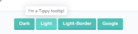
暗色主题:
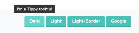
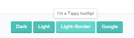
浅色:
浅色带边框:
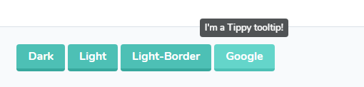
谷歌主题:
安装
NPM
npm install --save vue-tippy
yarn
yarn add vue-tippy
CDN
<script src="https://unpkg.com/vue-tippy@4/dist/vue-tippy.min.js"></script>
<script src="https://cdn.jsdelivr.net/npm/vue-tippy@4/dist/vue-tippy.min.js"></script>
使用
首先引入:
import Vue from "vue";
import VueTippy, { TippyComponent } from "vue-tippy";

Vue.use(VueTippy);
// or
Vue.use(VueTippy, {
  directive: "tippy", // => v-tippy
  flipDuration: 0,
  popperOptions: {
    modifiers: {
      preventOverflow: {
        enabled: false
      }
    }
  }
});

Vue.component("tippy", TippyComponent);
可选主题CSS
import "tippy.js/themes/light.css";
import "tippy.js/themes/light-border.css";
import "tippy.js/themes/google.css";
import "tippy.js/themes/translucent.css";
可以按照这样引入:
import { tippy } from "vue-tippy";
在你的组件中可以这样使用:
<button content="I'm a Tippy tooltip!" v-tippy>
  Tooltip using directive
</button>
或者这样
<tippy>

    <template v-slot:trigger>
        <button>
        Tooltip using component + slots
        </button>
    </template>

     I'm a Tippy tooltip!
</tippy>
或者
<tippy content="I'm a Tippy tooltip!">
   <button v-slot.trigger>
       Tooltip using component + trigger slot and content as attribute/prop
   </button>
</tippy>
或者
<tippy to="externalTrigger">
    I'm a Tippy tooltip!
</tippy>

<button name="externalTrigger">Tooltip using component</button>
或者
<tippy toSelector=".cssSelector">
    I'm a Tippy tooltip!
</tippy>

<button class="cssSelector">Tooltip using component</button>
示例
作者
Georges KABBOUCHI

相关项目