React Responsive
made with
React
React Responsive是React的用于响应式设计的媒体查询组件,最受支持、最易用的react media查询模块。
该模块非常简单,用户只需要指定一组要求,如果满足这些要求,则将渲染子项。如果用户调整页面窗口,还可以随之改变。
安装
Npm
npm i react-responsive
Yarn
yarn add react-responsive
使用
使用Hooks
import React from 'react'
import { useMediaQuery } from 'react-responsive'
const Example = () => {
const isDesktopOrLaptop = useMediaQuery({
query: '(min-device-width: 1224px)'
})
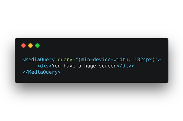
const isBigScreen = useMediaQuery({ query: '(min-device-width: 1824px)' })
const isTabletOrMobile = useMediaQuery({ query: '(max-width: 1224px)' })
const isTabletOrMobileDevice = useMediaQuery({
query: '(max-device-width: 1224px)'
})
const isPortrait = useMediaQuery({ query: '(orientation: portrait)' })
const isRetina = useMediaQuery({ query: '(min-resolution: 2dppx)' })
return (
<div>
<h1>Device Test!</h1>
{isDesktopOrLaptop && <>
<p>You are a desktop or laptop</p>
{isBigScreen && <p>You also have a huge screen</p>}
{isTabletOrMobile && <p>You are sized like a tablet or mobile phone though</p>}
</>}
{isTabletOrMobileDevice && <p>You are a tablet or mobile phone</p>}
<p>Your are in {isPortrait ? 'portrait' : 'landscape'} orientation</p>
{isRetina && <p>You are retina</p>}
</div>
)
}
使用组件
import MediaQuery from 'react-responsive'

const Example = () => (
  <div>
    <h1>Device Test!</h1>
    <MediaQuery minDeviceWidth={1224} device={{ deviceWidth: 1600 }}>
      <p>You are a desktop or laptop</p>
      <MediaQuery minDeviceWidth={1824}>
        <p>You also have a huge screen</p>
      </MediaQuery>
    </MediaQuery>
    <MediaQuery minResolution='2dppx'>
      {/* You can also use a function (render prop) as a child */}
      {(matches) =>
        matches
          ? <p>You are retina</p>
          : <p>You are not retina</p>
      }
    </MediaQuery>
  </div>
)
API
使用属性
为了适应react,你可以使用驼峰格式来构造media查询(如使用minDeviceWidth 代替 min-device-width)。所有可能缩写参见https://github.com/contra/react-responsive/blob/master/src/mediaQuery.js#L9。
作为缩写,任何数字都会添加'px'单位(1234 -> '1234px')。之前例子中的CSS media查询可以这样写:
import React from 'react'
import { useMediaQuery } from 'react-responsive'

const Example = () => {
  const isDesktopOrLaptop = useMediaQuery({ minDeviceWidth: 1224 })
  const isBigScreen = useMediaQuery({ minDeviceWidth: 1824 })
  const isTabletOrMobile = useMediaQuery({ maxWidth: 1224 })
  const isTabletOrMobileDevice = useMediaQuery({ maxDeviceWidth: 1224 })
  const isPortrait = useMediaQuery({ orientation: 'portrait' })
  const isRetina = useMediaQuery({ minResolution: '2dppx' })

  return (
    <div>
      ...
    </div>
  )
}
使用device属性强制指定设备
有时,可能需要渲染具有不同设备设置的组件,而不是自动检测到的组件。这在无法检测到这些设置(SSR)或用于测试的Node环境中尤为有用。
可能的key包括 orientation、 scan、 aspectRatio、 deviceAspectRatio、height、deviceHeight、 width、deviceWidth、 color、 colorIndex、 monochrome、 resolution 和type。
其中可能的Type可以是all、 grid、 aural、 braille、 handheld、 print、 projection、screen、 tty、 tv 或embossed
注:
device属性总是优先应用,甚至在可以检查到设备的时候(window.matchMedia存在时)
import { useMediaQuery } from 'react-responsive'

const Example = () => {
  const isDesktopOrLaptop = useMediaQuery(
     { minDeviceWidth: 1224 },
     { deviceWidth: 1600 } // `device` prop
  )

  return (
    <div>
      {isDesktopOrLaptop &&
        <p>
          this will always get rendered even if device is shorter than 1224px,
          that's because we overrode device settings with 'deviceWidth: 1600'.
        </p>
      }
    </div>
  )
}
通过上下文指定
你还可以通过React上下文(Context)将device传递给组件树中的每个useMediaQuery hook。这将简化server-side-rendering和Node环境中的测试,例如:
服务端渲染
import { Context as ResponsiveContext } from 'react-responsive'
import { renderToString } from 'react-dom/server'
import App from './App'

...
  // Context is just a regular React Context component, it accepts a `value` prop to be passed to consuming components
  const mobileApp = renderToString(
    <ResponsiveContext.Provider value={{ width: 500 }}>
      <App />
    </ResponsiveContext.Provider>
  )
...
测试
import { Context as ResponsiveContext } from 'react-responsive'
import { render } from '@testing-library/react'
import ProductsListing from './ProductsListing'

describe('ProductsListing', () => {
  test('matches the snapshot', () => {
    const { container: mobile } = render(
      <ResponsiveContext.Provider value={{ width: 300 }}>
        <ProductsListing />
      </ResponsiveContext.Provider>
    )
    expect(mobile).toMatchSnapshot()

    const { container: desktop } = render(
      <ResponsiveContext.Provider value={{ width: 1000 }}>
        <ProductsListing />
      </ResponsiveContext.Provider>
    )
    expect(desktop).toMatchSnapshot()
  })
})
注意,如果有
deviceprop传入,它将优先于上下文中的device。
onChange
可以使用onChange回调来指定当media 查询的值更改时将调用的更改处理程序。
import React from 'react'
import { useMediaQuery } from 'react-responsive'

const Example = () => {

  const handleMediaQueryChange = (matches) => {
    // matches will be true or false based on the value for the media query
  }
  const isDesktopOrLaptop = useMediaQuery(
    { minDeviceWidth: 1224 }, undefined,  handleMediaQueryChange
  );

  return (
    <div>
      ...
    </div>
  )
}
import React from 'react'
import MediaQuery from 'react-responsive'

const Example = () => {

  const handleMediaQueryChange = (matches) => {
    // matches will be true or false based on the value for the media query
  }

  return (
    <MediaQuery minDeviceWidth={1224} onChange={handleMediaQueryChange}>
      ...
    </MediaQuery>
  )
}
简易模式
现在,你可以创建特定于应用程序的断点并轻松地重用它们。以下是一个例子:
import { useMediaQuery } from 'react-responsive'

const Desktop = ({ children }) => {
  const isDesktop = useMediaQuery({ minWidth: 992 })
  return isDesktop ? children : null
}
const Tablet = ({ children }) => {
  const isTablet = useMediaQuery({ minWidth: 768, maxWidth: 991 })
  return isTablet ? children : null
}
const Mobile = ({ children }) => {
  const isMobile = useMediaQuery({ maxWidth: 767 })
  return isMobile ? children : null
}
const Default = ({ children }) => {
  const isNotMobile = useMediaQuery({ minWidth: 768 })
  return isNotMobile ? children : null
}

const Example = () => (
  <div>
    <Desktop>Desktop or laptop</Desktop>
    <Tablet>Tablet</Tablet>
    <Mobile>Mobile</Mobile>
    <Default>Not mobile (desktop or laptop or tablet)</Default>
  </div>
)

export default Example
Eric Schoffstall
@contrahacks
相关项目