Vue Apexcharts
made with
Vuejs

Vue Apexcharts
这是ApexCharts的Vue.js组件。
简介及使用教程
Apexcharts是一个现代的JavaScript图表库/可通过简单的API构建交互式图表和可视化。
Vue Apexcharts是ApexCharts的Vue.js组件。
安装
Npm
npm i apexcharts
npm i vue-apexcharts
Yarn
yarn add apexcharts
yarn add vue-apexcharts
使用
引入并注册
import VueApexCharts from 'vue-apexcharts'
Vue.use(VueApexCharts)

Vue.component('apexchart', VueApexCharts)
Template
<template>
   <div>
     <apexchart width="500" type="bar" :options="chartOptions" :series="series"></apexchart>
   </div>
</template>
data
export default {
data: function() {
return {
chartOptions: {
chart: {
id: 'vuechart-example'
},
xaxis: {
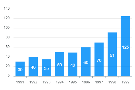
categories: [1991, 1992, 1993, 1994, 1995, 1996, 1997, 1998]
}
},
series: [{
name: 'series-1',
data: [30, 40, 35, 50, 49, 60, 70, 91]
}]
}
},
};
Props
| Prop | Type | Description |
|---|---|---|
| **series*** | Array | 数据,详见https://apexcharts.com/docs/series/ |
| **type*** | String | line, area, bar, pie, donut, scatter, bubble, heatmap, radialBar, candlestick |
| width | Number/String | 宽度度值,可以是100% 、 300px 或者 300 |
| height | Number/String | 高度值,可以是100% 、 300px 或者 300 |
| options | Object | 详见:https://apexcharts.com/docs/options/chart/type/ |
Methods
| Method | 描述 |
|---|---|
| updateSeries | 更新图表数据 |
| updateOptions | 更新配置 |
| toggleSeries | 切换图表数据的可见性。当你有自定义图例时很有用。 |
| appendData | 添加图标数据 |
| addText | 用于图表渲染后添加文字 |
| addXaxisAnnotation | 图表渲染后添加X轴注释 |
| addYaxisAnnotation | 图表渲染后添加Y轴注释 |
| addPointAnnotation | 图表渲染后添加点(xy)注释 |
使用示例
<template>
  <div class="example">
    <apexchart ref="demoChart" width="500" :options="chartOptions" :series="series"></apexchart>
  </div>
</template>

<script>
  functionName: function() {
    this.$refs.demoChart.updateOptions({ colors: newColors })
  },
</script>
作者
ApexCharts
@apexcharts
相关项目