Vue Smart Widget(智能小部件)
made with
Vuejs
简介及使用教程
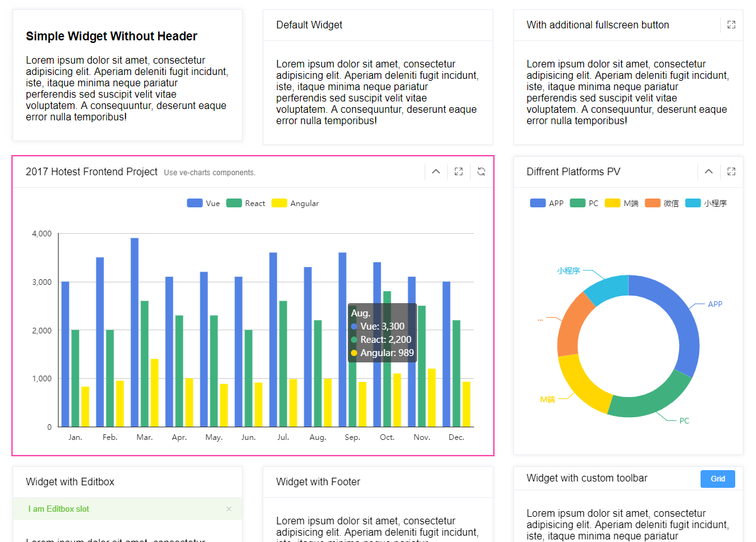
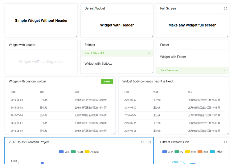
Vue Smart Widget(智能小部件)是一个灵活可扩展的内容容器组件,包括标题和正文部分。其中正文包括编辑框、内容,页脚。
与grid配合使用,还支持基于vue-grid-layout的可拖动和可调整大小的网格布局。
安装
Npm
npm i vue-smart-widget
Yarn
yarn add vue-smart-widget
用法
导入组件
import VueSmartWidget from 'vue-smart-widget'
Vue.use(VueSmartWidget)
仅使用小部件
import Vue from 'vue'
import { SmartWidget } from 'vue-smart-widget'

Vue.component('SmartWidget', SmartWidget)
HTML
<smart-widget title="Default Widget">
  <p>
    It's default widget.
  </p>
</smart-widget>
与grid一起使用
Script
new Vue({
  data () {
    return {
      layout: [
        { x: 0, y: 0, w: 4, h: 4, i: '0' },
        { x: 4, y: 0, w: 4, h: 4, i: '1' },
        { x: 8, y: 0, w: 4, h: 4, i: '2' }
      ]
    }
  }
})
HTML
<smart-widget-grid :layout="layout">
  <smart-widget slot="0" simple>
    <div class="layout-center">
      <h3>Simple Widget Without Header</h3>
    </div>
  </smart-widget>
  <smart-widget slot="1" title="Default Widget">
    <div class="layout-center">
      <h3>Default Widget With Header</h3>
    </div>
  </smart-widget>
  <smart-widget slot="2" title="Full Screen" fullscreen>
    <div class="layout-center">
      <h3>Make any widget full screen</h3>
    </div>
  </smart-widget>
</smart-widget-grid>
可用的props
// 小部件的唯一标识符
slot: 0,
// 小部件标题
title: String,
// 副标题
subTitle: String,
// 设置 `widget-body__content` 填充样式
padding: { type: [Number, Array], default: () => [12, 20] },
// 切换小部件模式
simple: { type: Boolean, default: false },
// 显示快速Masktoggle加载掩码
loading: { type: Boolean, default: false },
// 切换全屏按钮
fullscreen: { type: Boolean, default: false },
// 切换折叠按钮
collapse: { type: Boolean, default: false },
// 切换刷新按钮
refresh: { type: Boolean, default: false },
// 切换 `widget-body__content` 固定高度
fixedHeight: { type: Boolean, default: false },
// 何时显示卡片阴影
shadow: { type: String, default: 'always' },
// 卡片翻页风格
translateY: { type: Number, default: 0 }
SmartWidget Props
| 属性 | 描述 | 类型 | 接受值 | 默认 |
|---|---|---|---|---|
| slot | 小部件插槽,小部件的唯一标识符。指SmartWidgetGrid Props |
String | – | – |
| title | 小部件标题标题 | String | – | – |
| subTitle | 小部件标题副标题 | String | – | – |
| padding | 小部件主体中的填充 | [Number, Array] | – | [12, 20] |
| simple | 没有标题的小部件 | Boolean | true or false |
false |
| loading | 确定是否正在加载 | Boolean | true or false |
false |
| fullscreen | 确定是否有全屏按钮 | Boolean | true or false |
false |
| collapse | 确定是否有折叠按钮,仅支持 smart-widget |
Boolean | true or false |
false |
| refresh | 确定是否有刷新按钮 | Boolean | true or false |
false |
| fixedHeight | 确定小部件主体的高度是否固定,仅支持 smart-widget |
Boolean | true or false |
false |
| shadow | 何时显示卡片阴影 | String | always、hover、never |
always |
| translateY | 垂直变换的长度 | Number | – | 0 |
| isActived | 确定小部件是否处于活动状态 | Boolean | true or false |
false |
| activedColor | 激活的小部件 box-shadow 颜色,通常与isActived 属性一起使用 |
String | hex color | #0076db |
| headerHeight | 小部件标题高度(像素) | Number | – | 48 |
SmartWidget 方法
| 名称 | 描述 | 参量 |
|---|---|---|
| move | 每次移动物品并更改位置 | (i, newX, newY) |
| moved | 每次完成移动并更改位置时, | (i, newX, newY) |
| resize | 每次调整大小并更改大小时, | (i, newH, newW, newHPx, newWPx) |
| resized | 每次完成移动并更改位置时, | (i, newH, newW, newHPx, newWPx) |
| container-resized | 每次网格项目/布局容器更改大小时(浏览器窗口或其他) | (i, newH, newW, newHPx, newWPx) |
| on-refresh | 当小部件需要从ajax方法中获取数据时使用,通常与loading属性一起使用 |
— |
| before-fullscreen | 在全屏之前的窗口小部件时使用,通常与fullscreen属性一起使用 |
true 要么 false |
| on-fullscreen | 当窗口小部件已经全屏显示时使用,通常与fullscreen属性一起使用 |
true 要么 false |
SmartWidget中的CSS选择器
| 名称 | 描述 |
|---|---|
.smartwidget |
SmartWidget中的主要选择器 |
.is-actived |
小部件的状态为活动状态 |
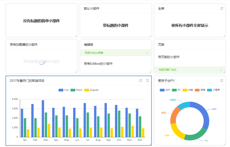
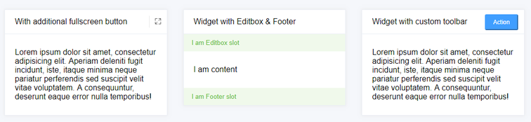
示例
作者
xiaoluoboding

相关项目